WEAVE
Design system
[01. Challenge]
The company grew fast across healthcare and real estate, and its products drifted apart. Inconsistent UI, duplicated components and slower releases became design debt.
[02. Strategy]
As UX Lead I built Weave: foundations first, WCAG 2.2 AA in the tokens, and an AI version that tools like Copilot, Cursor and v0 can read and follow.
[03. Results]
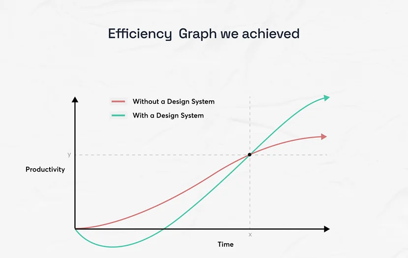
Development time down 39%, satisfaction up 36%, 45+ components, and one rulebook for designers, developers and AI.
Act 1
Finding the cracks
A FigJam map of every component, a UX audit, user testing and a competitive review (Material Design, Carbon) looked for what was holding the products together. Two rounds of interviews with 20+ creators tuned spacing and colour.
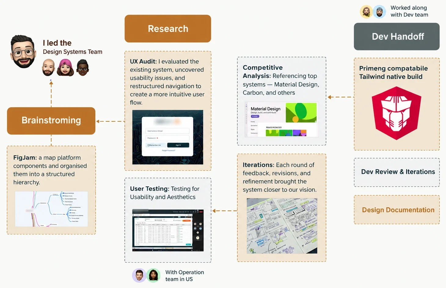
Three gaps
- Inconsistent visual language
- Components with no modularity
- No documentation
The sharpest finding
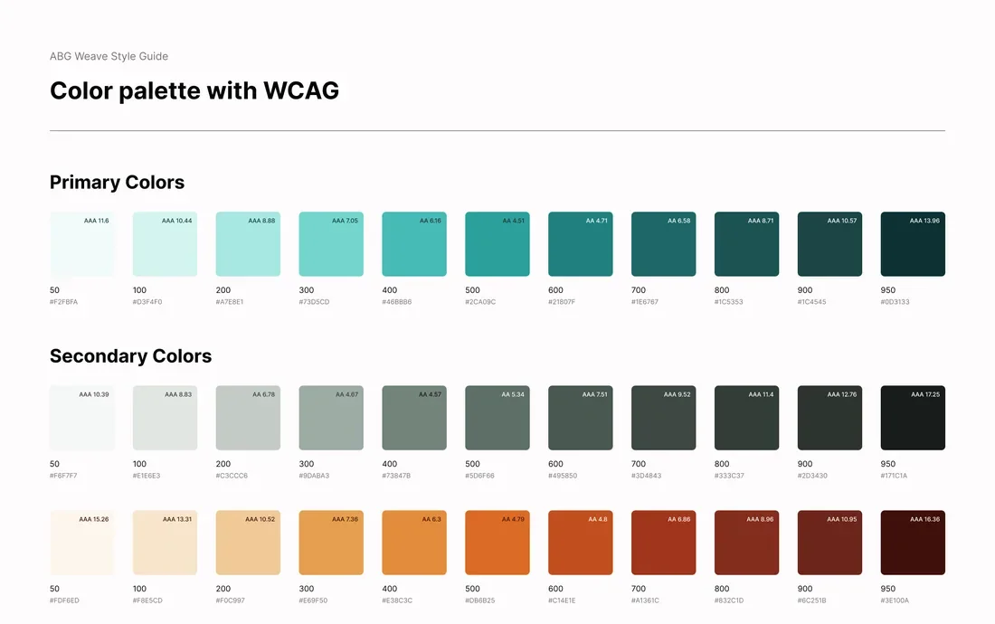
Auditing the brand colours against WCAG 2.2 showed several failing on white.
| Token | Ratio | Against the 3:1 and 4.5:1 lines | Result |
|---|---|---|---|
| Accent#E69F50 | 2.22:1 | Fails as text, border or icon | |
| Success#10B981 | 2.54:1 | Fails | |
| Info#0EA5E9 | 2.77:1 | Fails | |
| Danger#EF4444 | 3.76:1 | Fails as normal text | |
| Focus glow | 1.16:1 | Decorative only |
79.1%
of home pages have low-contrast text, the most common failure on the web
WebAIM Million, February 2025: 94.8% of the top 1,000,000 home pages had detected WCAG 2 failures. Industry context, not a result from this project.
34%
faster task completion for designers with a design system
Figma data science team, as published on Figma's blog. Industry context for the 39% later on this page, not a result from this project.
Act 2
The turning point: foundations first
With limited time, we fixed the fundamentals first: tokens for colour, type, spacing, radius and elevation, synced from Tokens Studio to GitHub and built Tailwind-native and PrimeNG-compatible.
Layered tokens
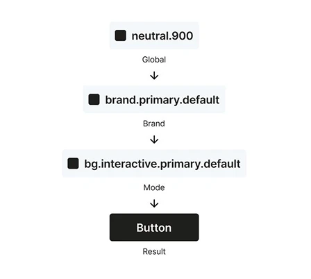
Every value resolves through layers, from global to brand to mode to result, so one change reaches every component. Tokens are synced from Tokens Studio to GitHub.
- Colour
- Type
- Spacing
- Radius
- Elevation
| Layer | Example token |
|---|---|
| Global | neutral.900 |
| Brand | brand.primary.default |
| Mode | bg.interactive.primary.default |
| Result | Primary button |
Fix by addition
Failing colours stayed. Each got an accessible companion token, so nothing already shipped had to change.
| Token | Before | After |
|---|---|---|
| Danger | 3.76:1 | 6.47:1 |
| Success | 2.54:1 | 5.48:1 |
| Secondary text | — | 5.33:1 |
Focus you can see
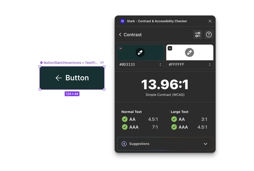
A solid 2px outline with a 2px offset in #0D3133 replaced the faint glow, which measured about 1.16:1.
| Token | Before | After |
|---|---|---|
| Focus indicator | 1.16:1 | 13.96:1 |
Act 3
Building the components
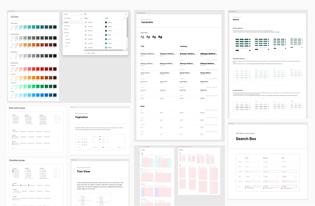
With the tokens in place, the FigJam component map became a library: 45+ components, each specified state by state, built to match Angular 17, PrimeNG and Tailwind so designers and developers use the same names.
Style guide
Colour, type, spacing, radius and elevation, documented once and resolved through the layered tokens.
Component library
Every component specified state by state, in light and dark modes, in Figma and a live Storybook.
Content guide
Shared wording for labels and messages, so the products sound like one product.
Act 4
What it delivered
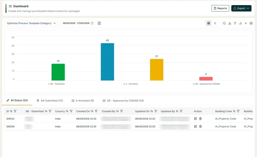
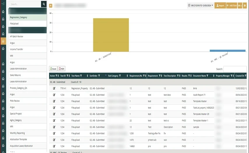
The test of a system is a real screen. Here are two dashboards before Weave and after: same data, one visual language.
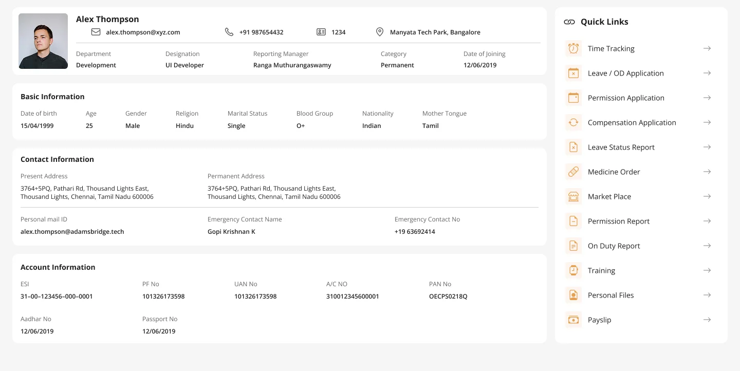
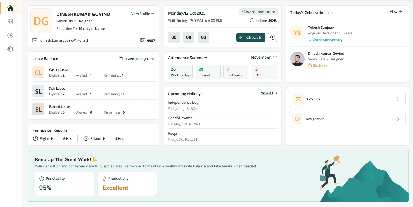
The same system carried into an employee app. Its older profile page is on the left and its home screen, built with Weave, is on the right: two different screens of one product, in one visual language.
39%
less development time
90
accessibility score
Google PageSpeed Insights, desktop, on the product login page.
36%
higher satisfaction
Satisfaction rose 36%, at least 90% of the initial goals were met, and hand-off to developers improved.
Consistency saves countless hours that used to go into rework and misaligned styles.
Act 5
The update: an AI version
Weave now has a second kind of user: the tools that generate screens and code. Once the system was live, we shipped an update so they can read it too.
DESIGN.md
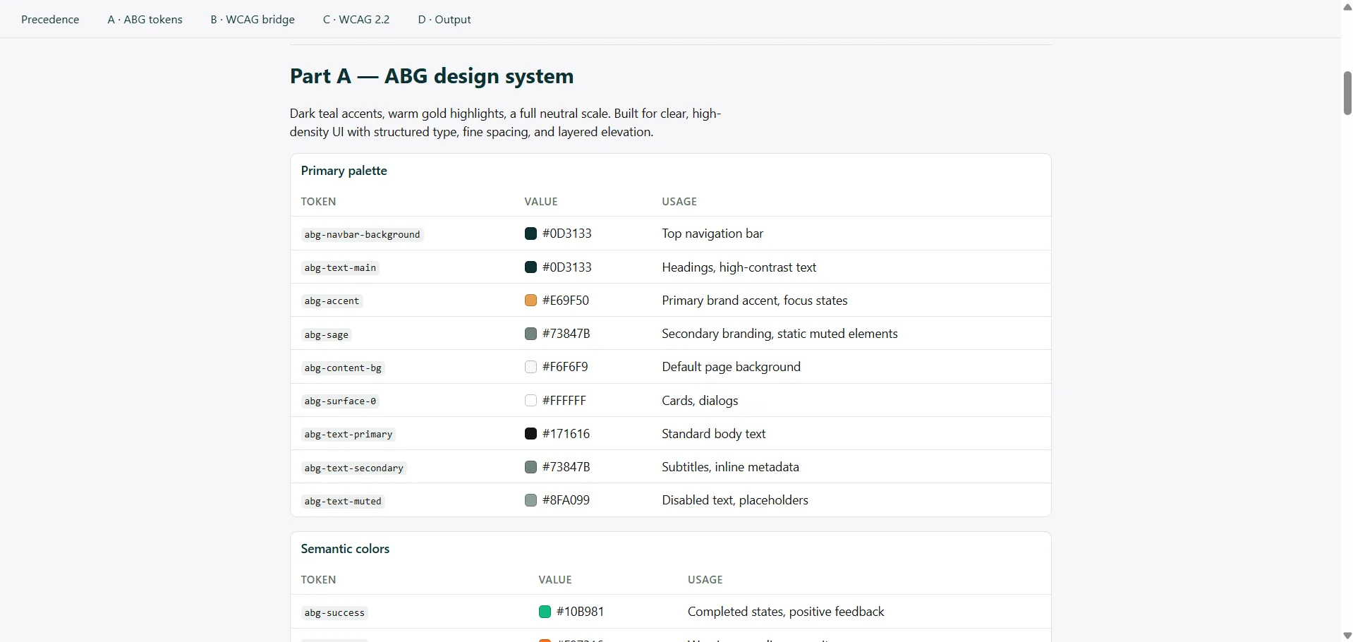
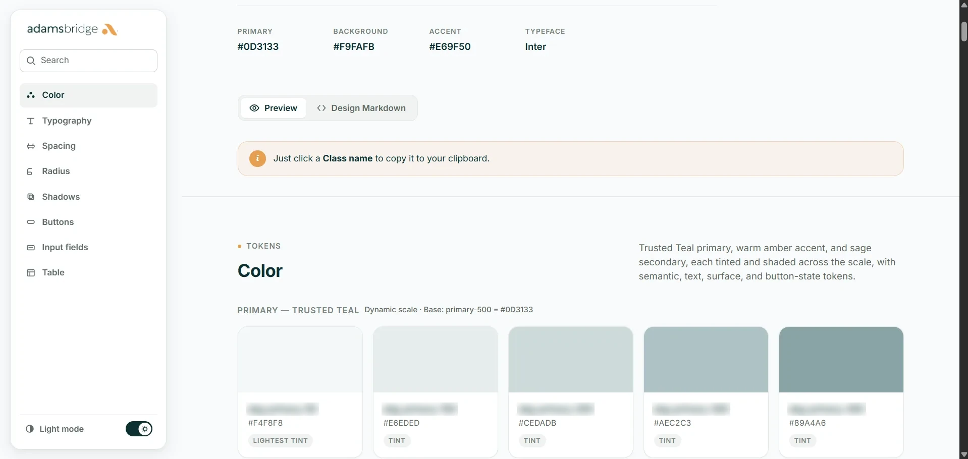
The Storybook exports every colour, type, spacing, radius and shadow token as one portable file. Drop it in a repo and AI tools write code that follows the system.
One instructions file
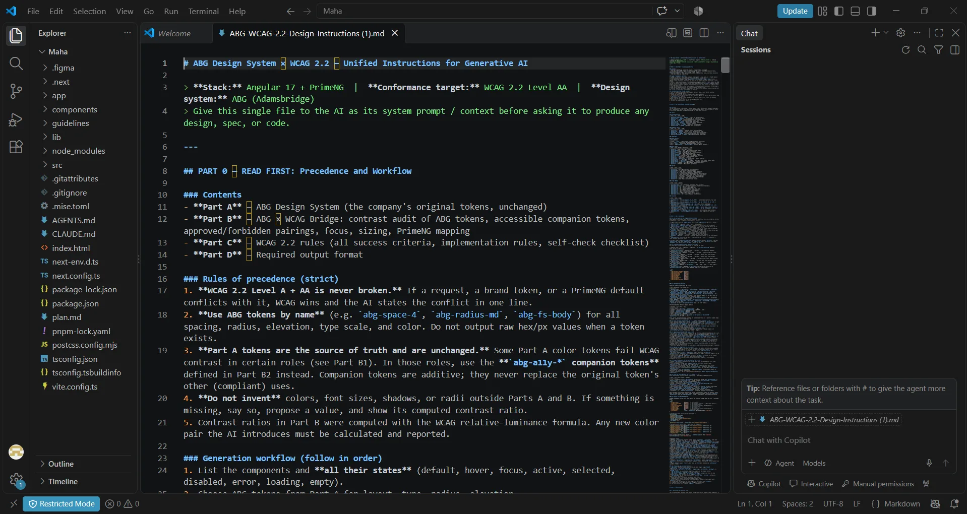
Weave and WCAG 2.2 merged into a single brief for generative AI: Angular 17, PrimeNG, AA conformance, with strict rules of precedence.
Guardrails
WCAG is never broken. Tokens are used by name, not hex. Missing values are flagged with a computed contrast ratio, never guessed.
It also lists 12 things the AI must never output, such as the accent colour as text on a light surface, white text on the accent fill, status shown by colour alone, or placeholder-only inputs.
Step 1, export. Storybook publishes every token, and its Design Markdown tab turns them into a single DESIGN.md.
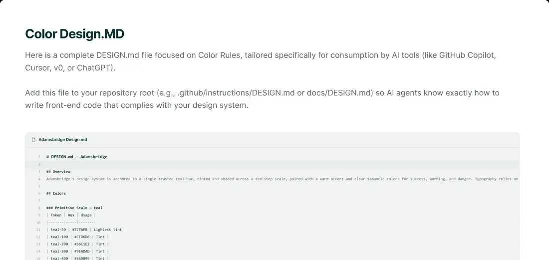
Step 2, brief. Weave and WCAG 2.2 merge into one instructions file, kept as markdown for the tools and as a readable page for people.