IAS Academy LMS
A learning platform where exam-prep students hand in written answers, mentors correct them and the academy keeps it all running. Designed and built with Claude Code.
[01. What I designed]
I was the product owner and UX designer: a written spec, a token-based design system and three role experiences (Student, Mentor, Admin), light and dark.
[02. What I built]
Built in 20 small steps with Claude Code, each with its own tests: 747 backend, 308 component and 166 end-to-end tests pass.
[03. Where AI helped]
Claude Code was my pair-builder. I set the spec, the rules and the checks; it wrote the code step by step.
Act 1
Hand in your answers. Get them back corrected.
Preparing for the IAS exams means writing a lot of long-form answers and waiting for expert feedback. At this academy that loop ran on files and messages. The goal was one trustworthy place for the whole loop, where students’ private papers and marks stay private.
Student
Often on a phone. Wants to know what is due, whether the upload worked and how they are doing over time.
Mentor
Long review sessions on a laptop. Wants the oldest waiting papers first and a fast path from queue to returned marks.
Admin
Runs the academy. Wants accounts, tests and tasks under control and a clear view of what needs attention.
Act 2
One status flow as the spine
Every paper moves one way: Uploaded, In review, Corrected. That single flow drives the dashboards, the queue, the badges and the notifications. Each status pairs an icon, a label and a colour, so colour is never the only signal.
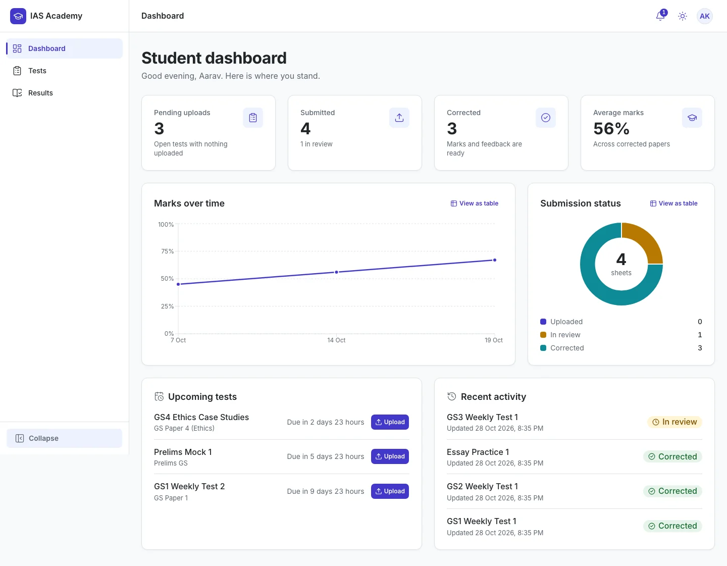
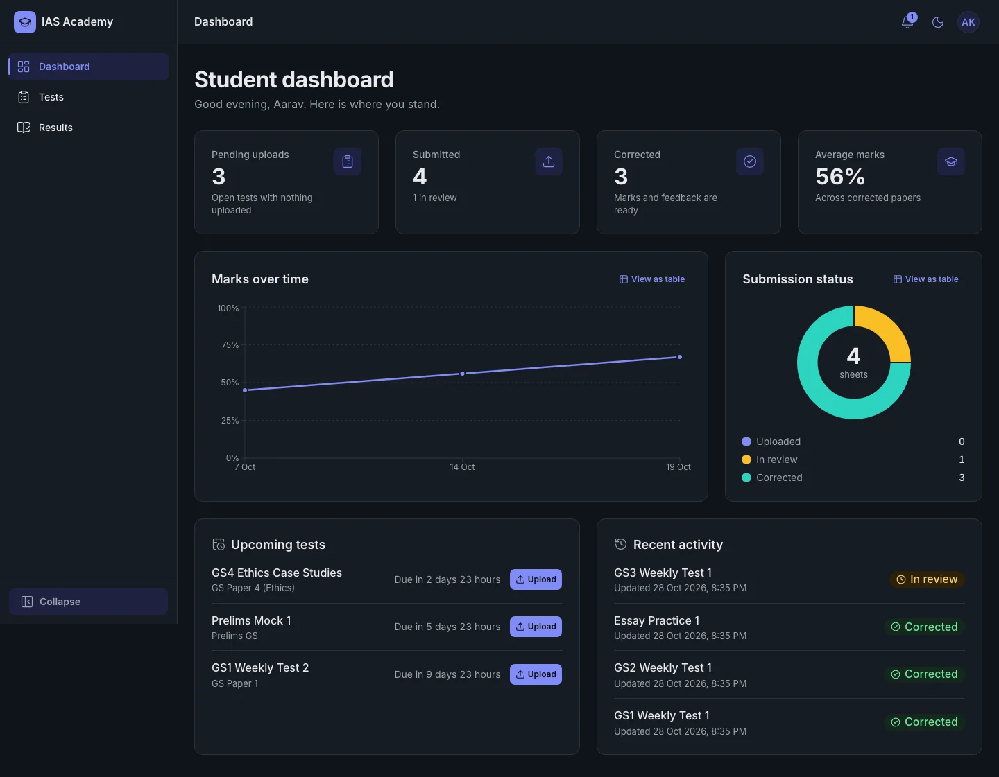
Students see where they stand
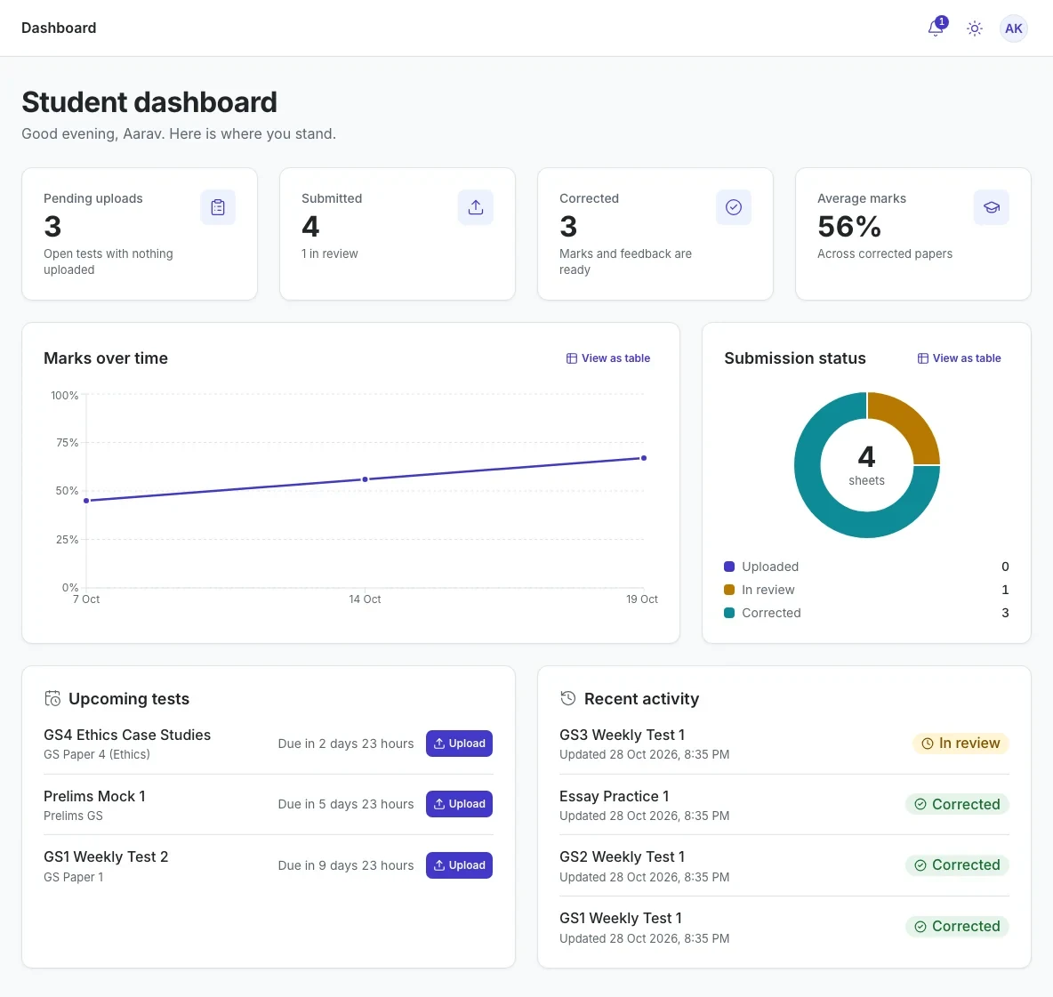
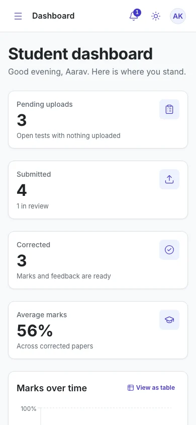
Four stat cards lead into a marks-over-time chart and a status donut. Upcoming tests carry an Upload button and a live countdown. Every chart has a 'View as table' twin.
- Pending uploads
- Submitted
- Corrected
- Average marks
Upload says why it is disabled
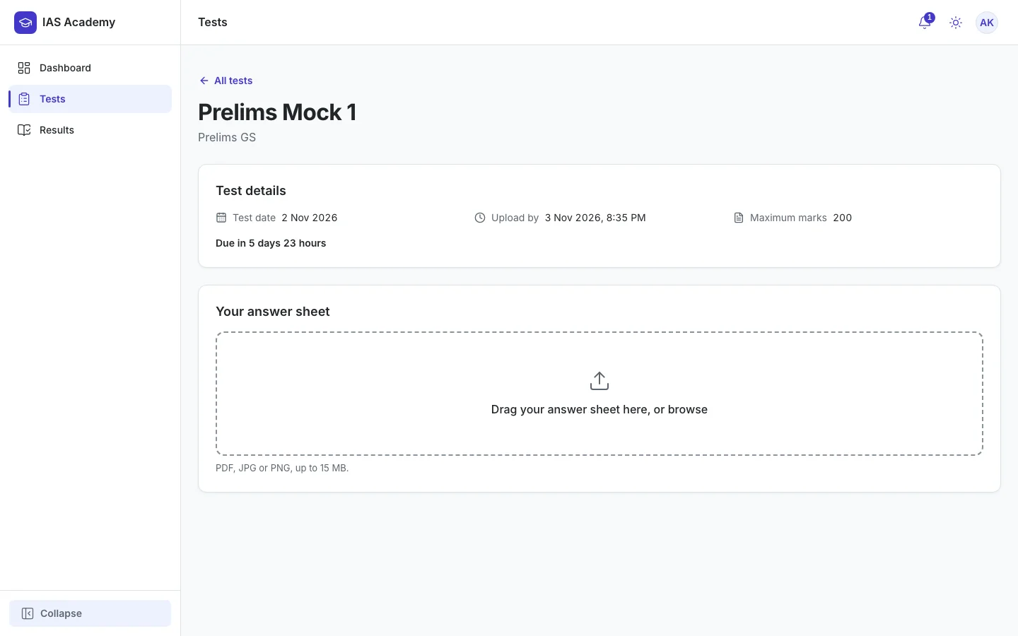
One large drop zone with the rules up front. When the button is off it gives the reason, such as the deadline has passed, instead of simply greying out. A student can replace a paper only while it is still Uploaded.
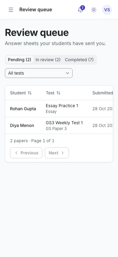
Mentors get a queue, oldest first
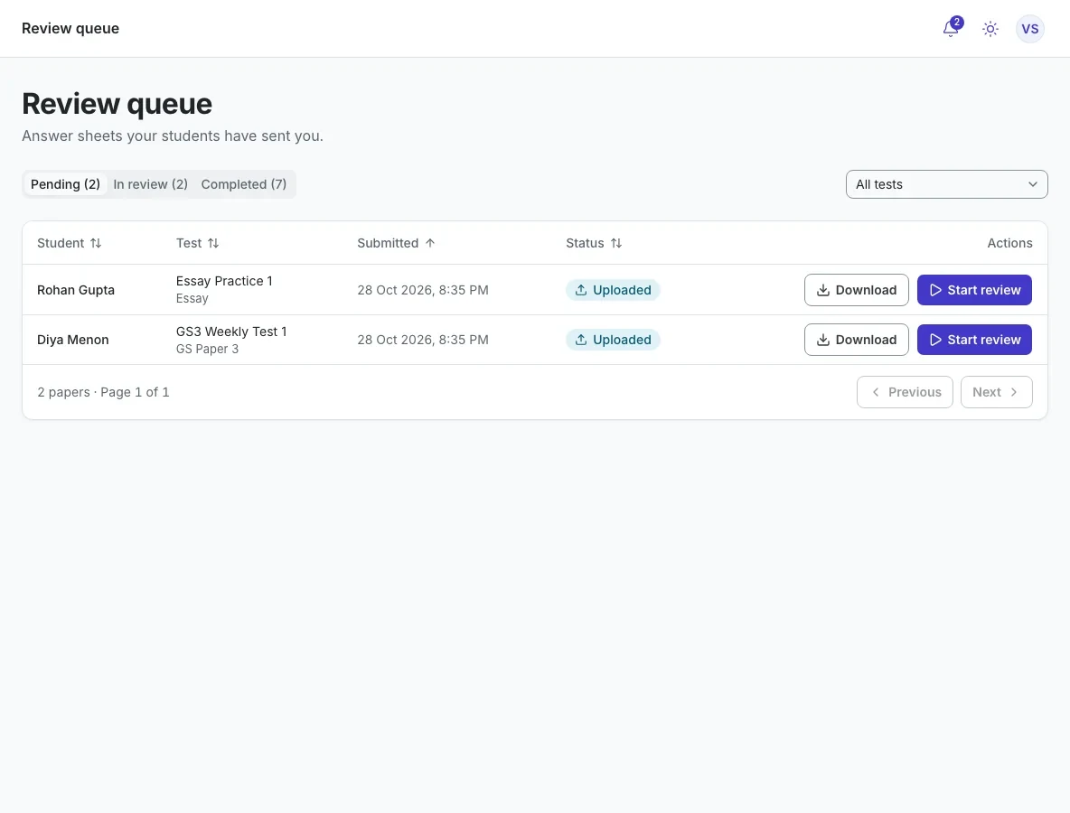
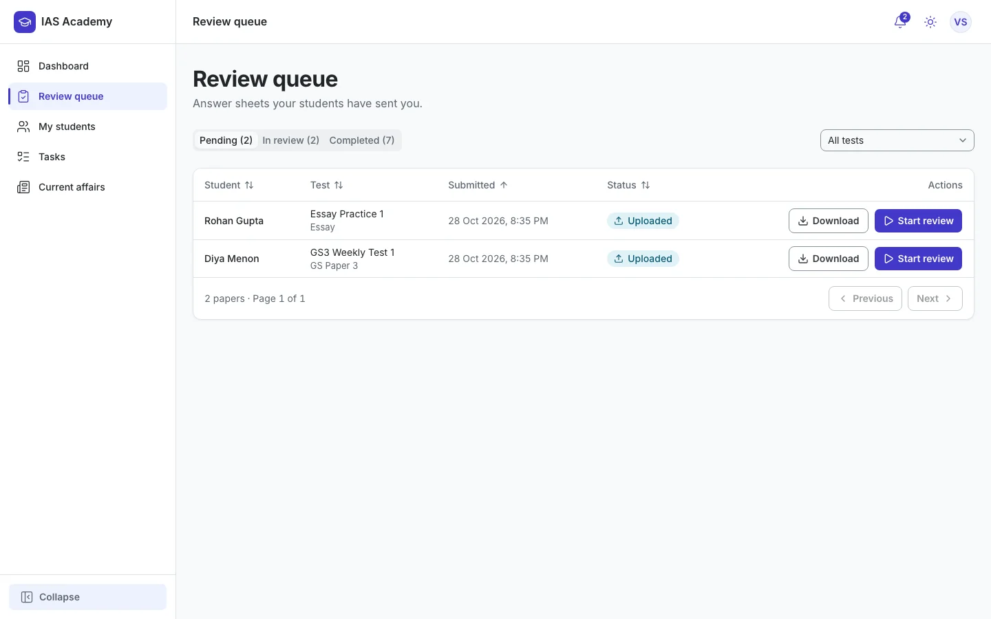
Pending, In review and Completed tabs with counts, sortable columns and a per-test filter. The queue shows only what is needed to pick the next paper, never marks or file names. Starting a review locks the student's upload.
- Oldest first
- Start review
- Locked once started
Marks, feedback and the corrected sheet in one place
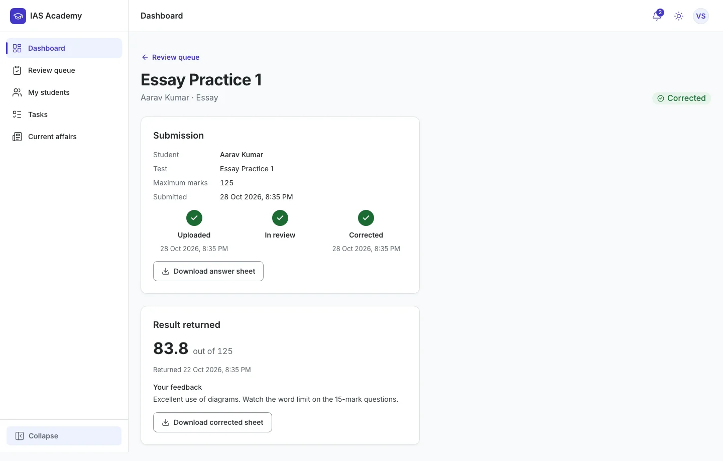
A three-step timeline (Uploaded, In review, Corrected) with timestamps, then the returned marks and feedback. The student sees the result as soon as it is returned.
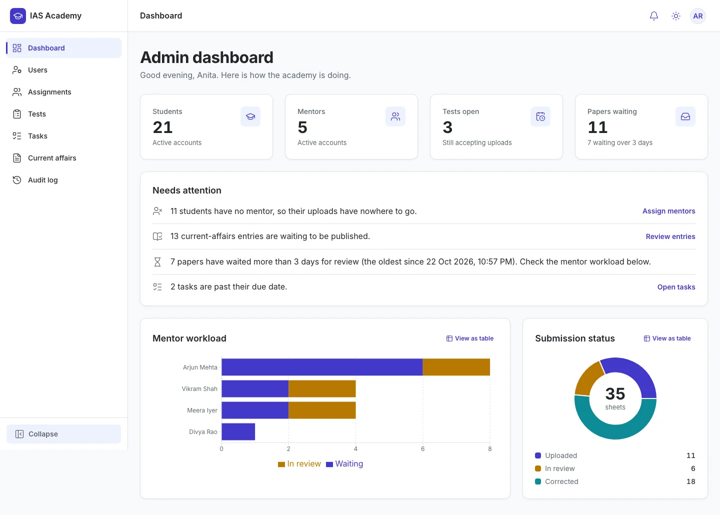
Admin sees what needs attention, as sentences
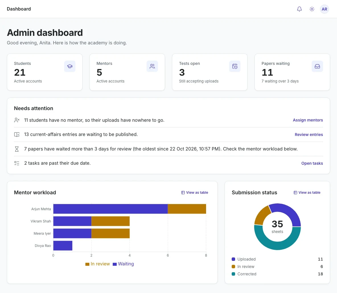
The dashboard turns problems into plain sentences with a next action, such as 'Students have no mentor, so their uploads have nowhere to go' with an Assign mentors link.
- No mentor
- Awaiting publishing
- Waiting over 3 days
- Overdue tasks
Act 3
Dark mode and phones
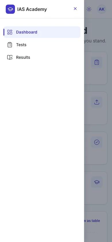
Light is the default. Dark is a full-parity option built from the same tokens, not a separate stylesheet: never pure black, indigo lightened, chart colours re-tuned in the same order. Students will often be on phones, so every page was checked at 360 px in both themes.
0
axe violations
On every page, in both themes.
100
Lighthouse accessibility
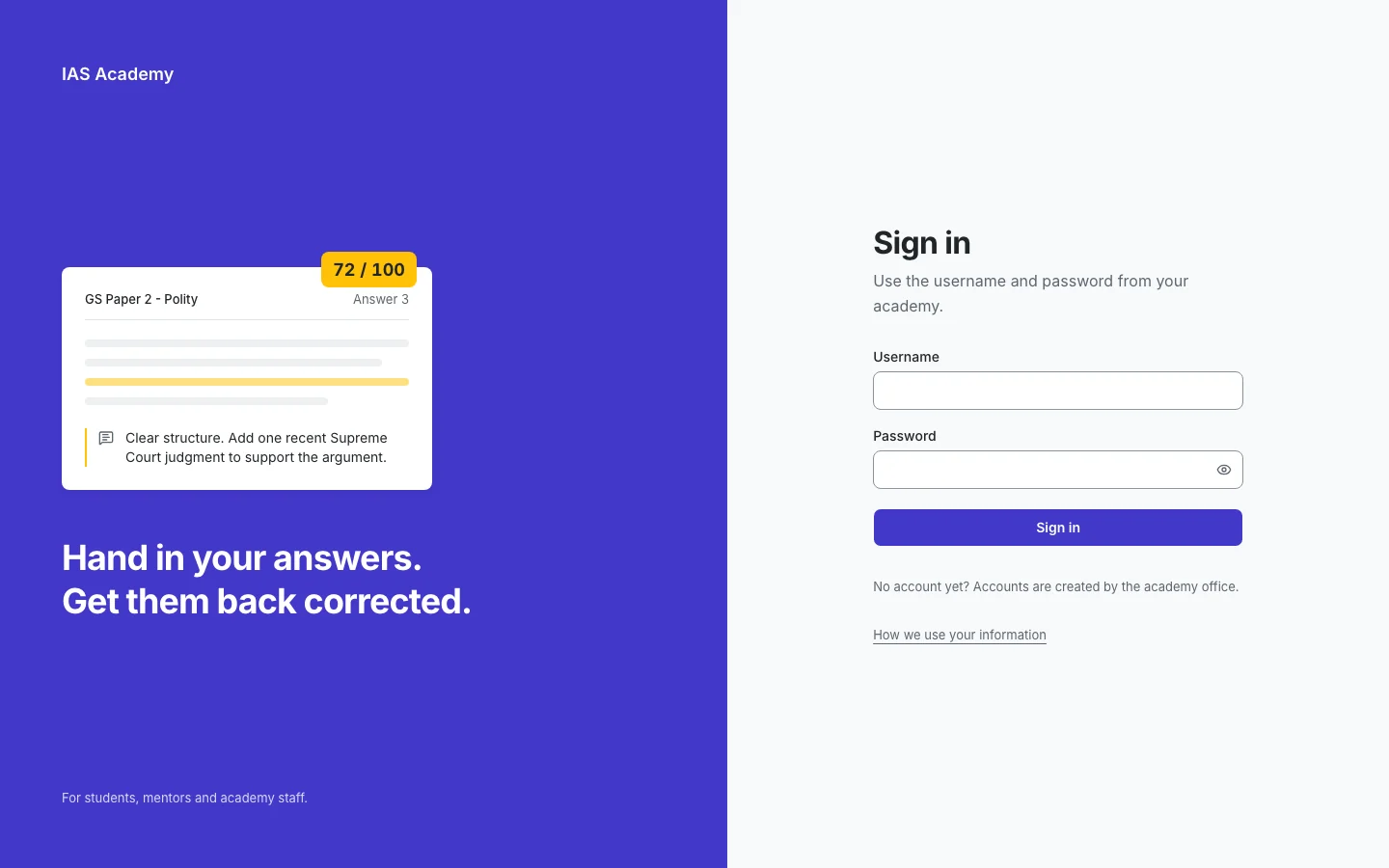
Sign-in page, mobile. Measured on a local production build.
Act 4
What is done, and what is not
All 20 build steps and the admin dashboard are built and tested. Nothing is live yet, and no real students have used it: the build was driven by a written spec, not by user research. Usability sessions, the privacy choices (retention, deletion, consent for minors) and a card layout for wide tables on small screens are the next steps.
- Role
- Product owner and UX designer
- Built with
- Claude Code, in 20 steps (10 to 22 Oct 2026)
- Roles
- Student, Mentor, Admin
- Status
- Built and tested locally, not deployed
Define tokens and states before screens, and let one simple status flow drive the whole product.